Experience Street Food at Home
Soulfood hero logo

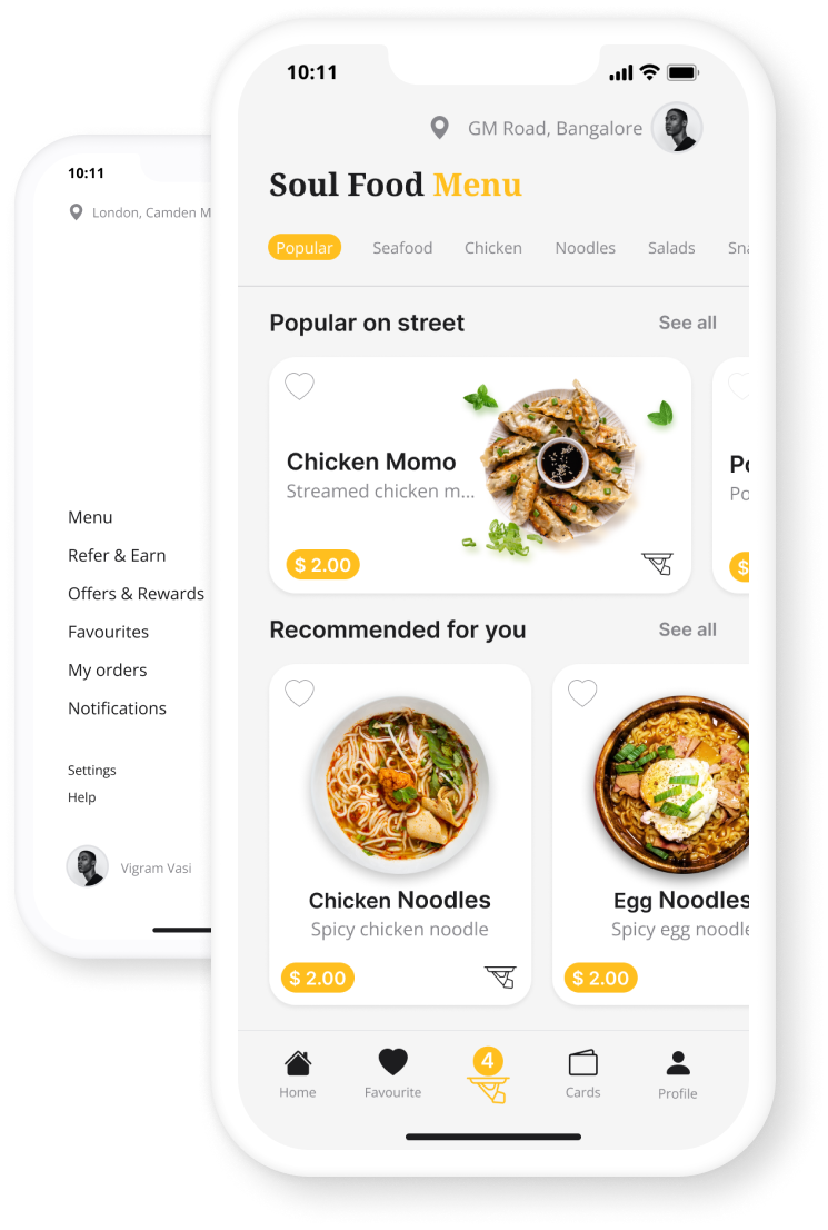
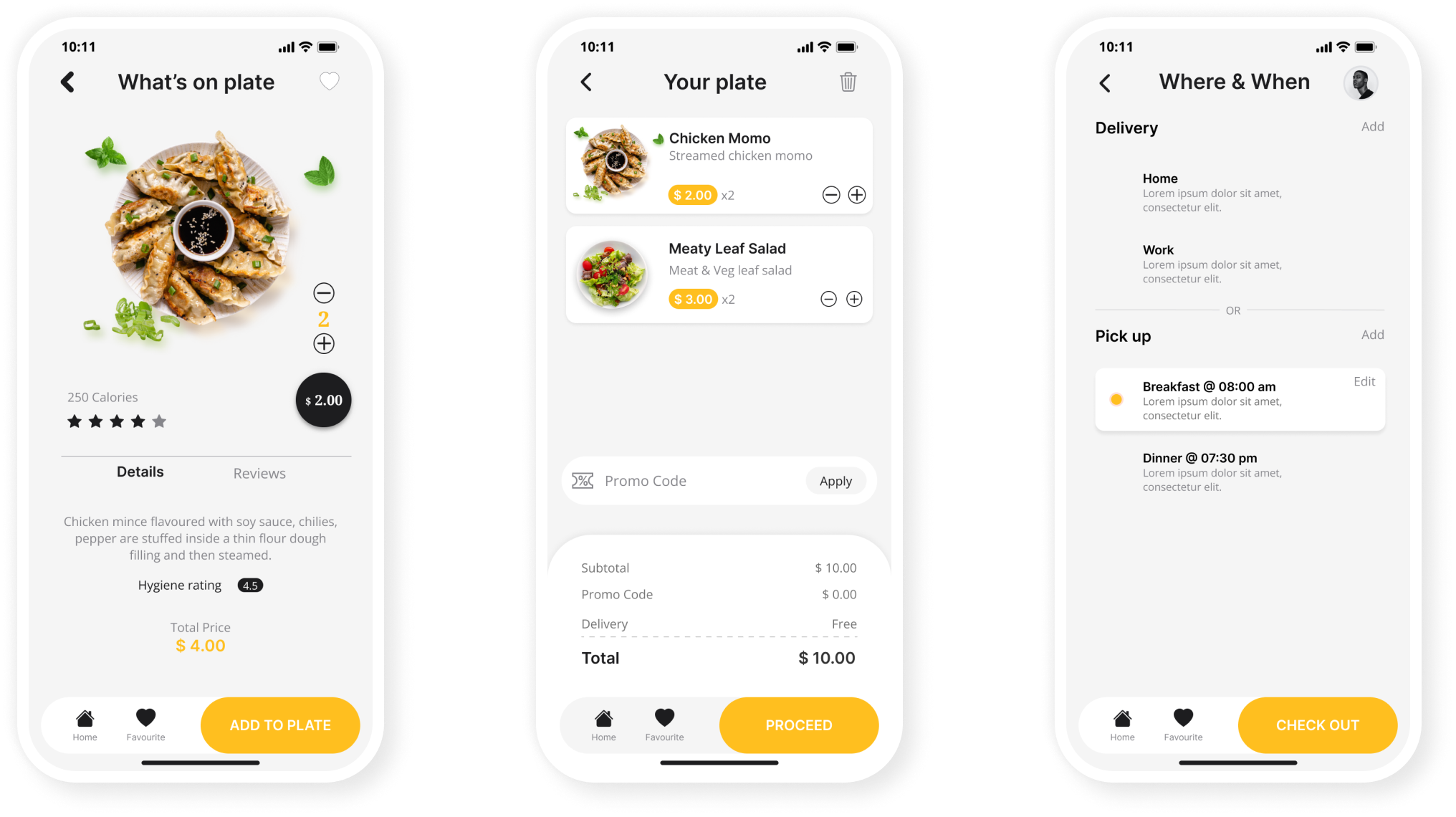
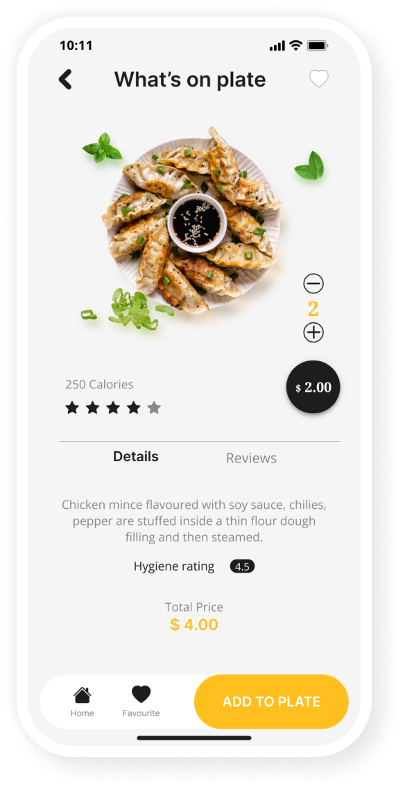
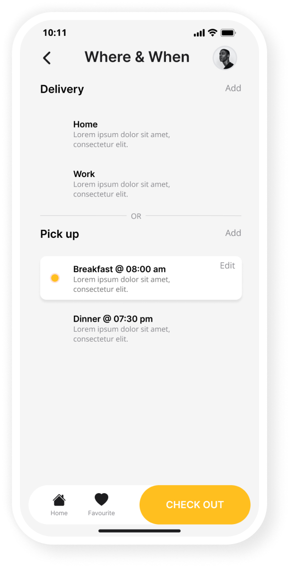
The Soul food app lets the customers order street food from their local vendors and experience street food from home. The customers can place either home delivery or self-pickup order without stepping on the road.

App mockup hero image

Role

Ux Designer

Timeframe

4 Weeks

Year

2022

Figma logo

About the project

Street food provides sustenance and nutrition to large-scale groups of the population. However, being neglected by online food delivery apps. Some people can't step out but enjoys eating street foods. On the other hand, they are tense about hygiene. This is where Soulfood comes in.

Solution

  • My goal was to design a mobile app that lets users order their favorite street food quickly and easily from home.
  • Schedule a pickup feature for those who wish to grap a street food on go without need to wait on the street.
  • To ensure the quality of the food allow customer to provide hygiene rating after the order delivery.
App mockup image 01

Design Process

I used the Lean UX principle in the development of the “Soulfood” app which focused on the user experience under design. It requires a greater level of collaboration with the entire team. The core objective is to focus on obtaining feedback as early as possible so that it can be used to make quick decisions.

Typical questions might include:

  • Who are our users?
  • What is the product used for?
  • When is it used?
  • What situations is it used in?
  • What will be the most important functionality?
  • What’s the biggest risk to product delivery?
Design sprint

Competitive Analysis

The Competitors don’t have street-food vendors.

  • With the above statement in mind. I analyzed the three most popular food delivery apps in the following context such as general information, first impression, interaction, visual design, content, and accessibilities.
  • I found that almost none of them had this aspect to help the street food vendor or the physically challenged to experience the street food. This then becomes my opportunity for a solution.
Competitors logo

User Interviews

  • Even though I saw from the research and competitive analysis street food vendors’ contribution to the food supply is huge. Street food provides a convenient diet for many people in developing countries, and according to a 2007 study from the Food and Agriculture Organization, 2.5 billion people eat street food every day, with consumption supporting the livelihood of millions of low-income people and contributing greatly to the economy.
  • However, I’ve conducted interviews with 10 people including male, female, non-binary and physically challenged. I’ve asked them questions below to find their experience with eating street food and organized my data through affinity mapping.

Questions Asked Like

  • Tell me about the experience of eating street food?
  • How often do you eat street food?
  • What are the factors that stop you from eating street food?
  • What is that you don’t like eating on street?
  • Tell me about a time you regret eating street food?
  • What do you think would motivate more people to eat street food?

Persona

Persona image 1

Research Insights

Affinity map

THEME 01: Hygiene & Quality

  • Street food quality can be questionable
  • Street food can be related to health issues in many cases
  • Street food vendors end up spreading garbage and filth increasing the risk of germs and bacteria
  • Street foods are not cooked properly sometimes

THEME 02: Convenience

  • Great taste and variety
  • Budget friendly
  • Meeting point
  • Grab and go food
  • Unhealthy but my heart run for it

THEME 03: Vendors Challenge

  • Lack of education
  • Lack of experience in street food vending
  • Challenges faced due to lack of infrastructural support
  • Lack of monitoring and lack of guidelines from the government regarding street food vending

THEME 04: Infrastructure

  • No equipment for disabled people
  • Place not pet friendly
  • The Surroundings aren’t clean
  • Near to the house, workplace, and collage
  • One can see into the kitchen

User flow Map

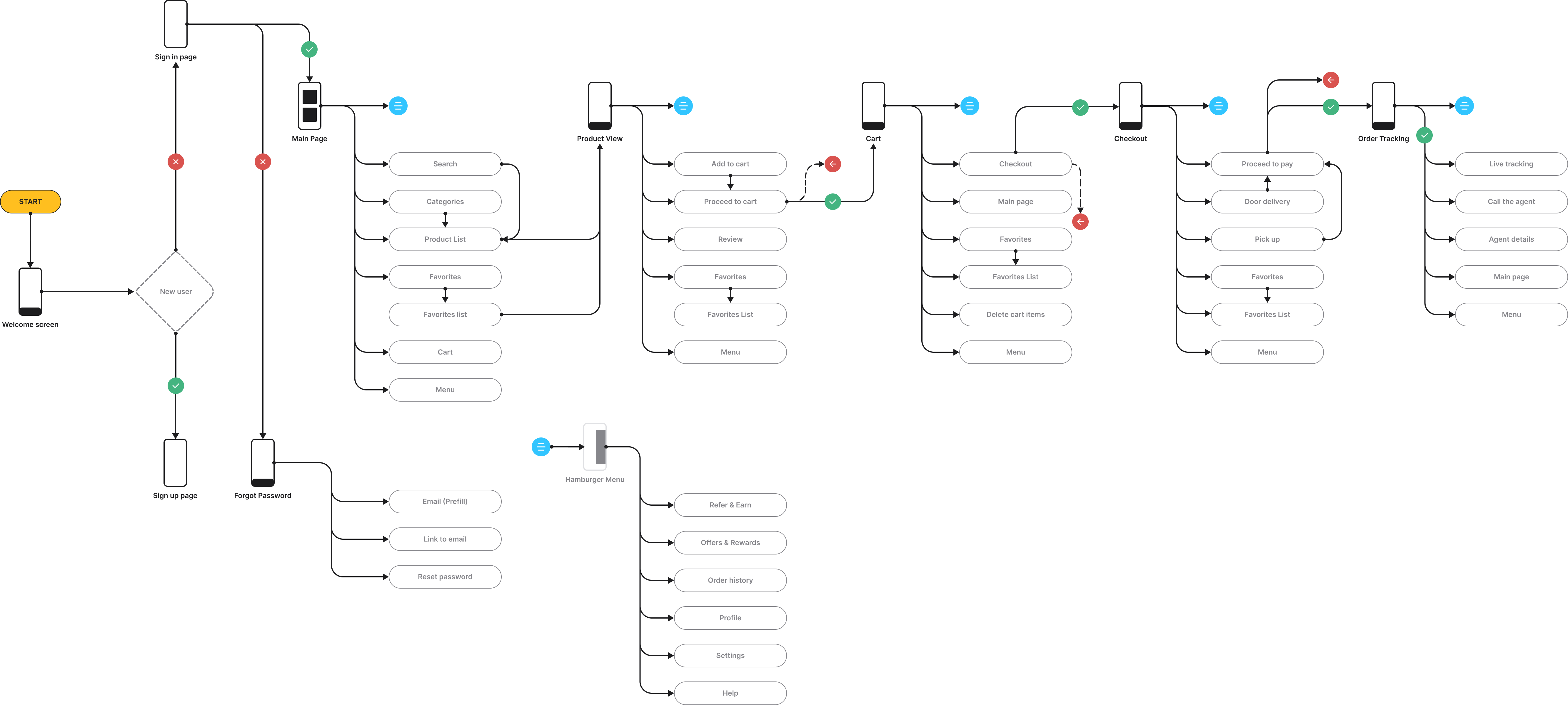
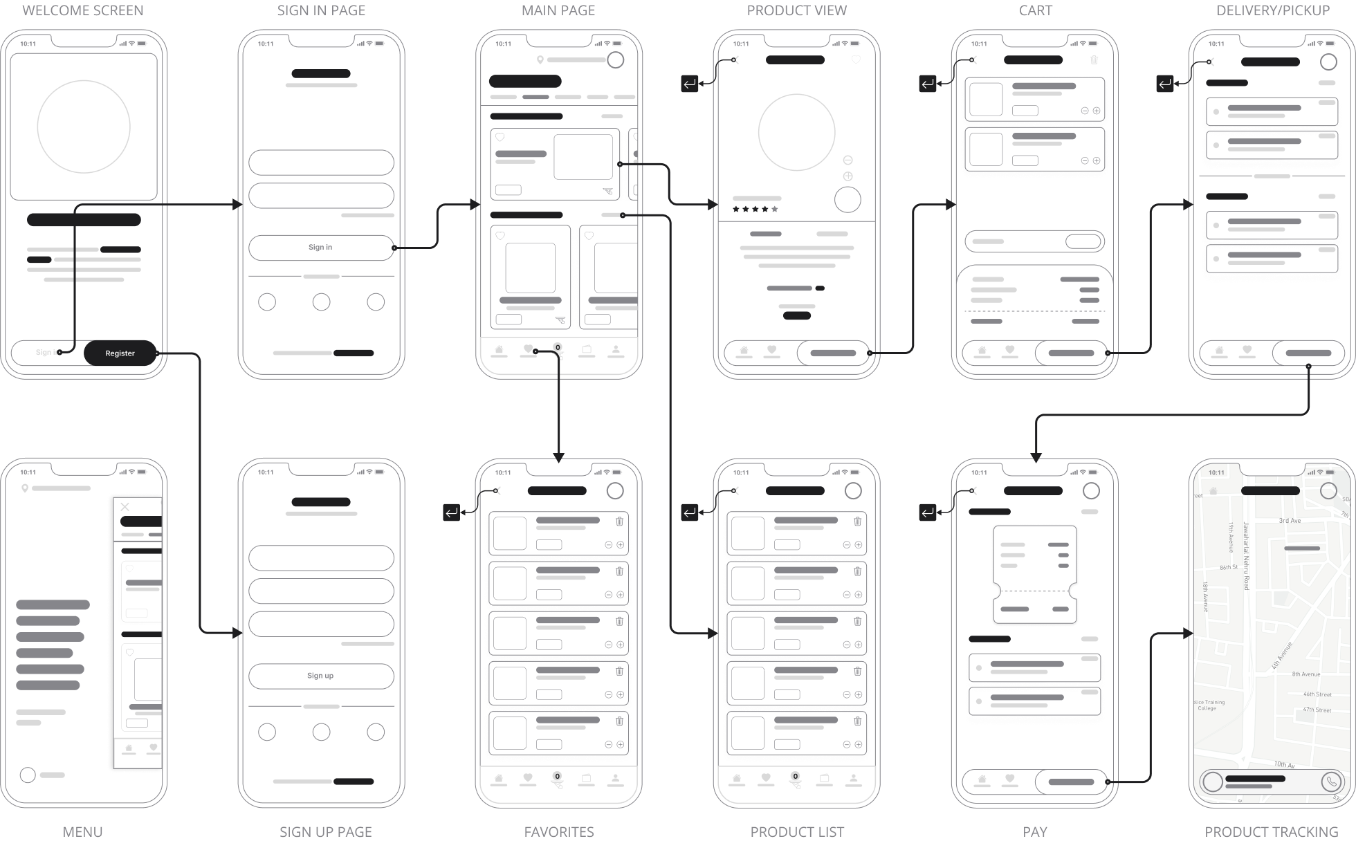
The user flow lays out the user’s movement through the product, mapping out every step the user takes-from the entry point right through to the final interaction, such as placing a pickup order helps determine the information architecture.

User flow chart

Wireframe

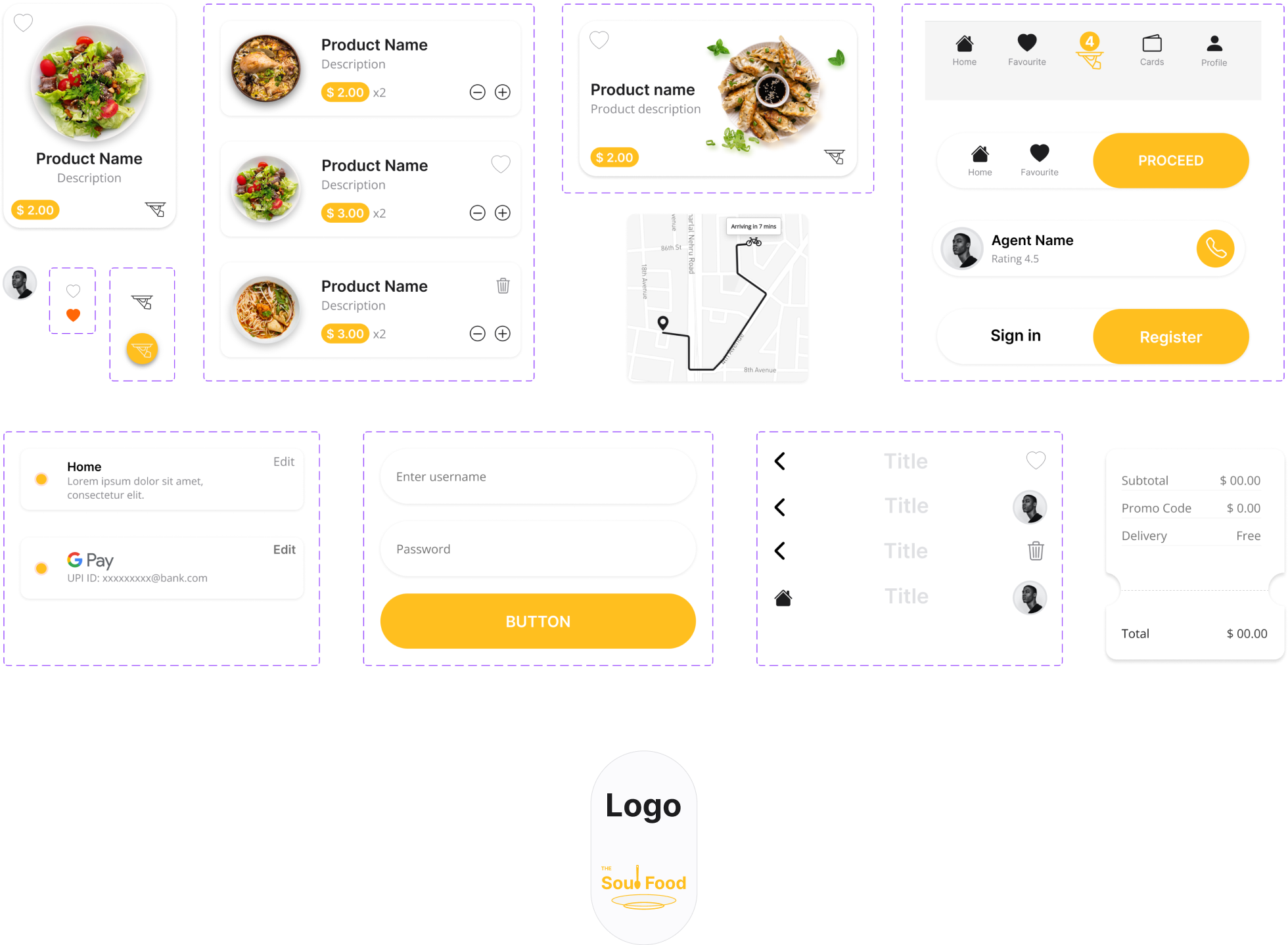
I followed Crazy 8’s in my Design Sprint method to push beyond my first idea and generate a wide variety of solutions. And I have turned my revised sketch into a digital low-fidelity wireframe prototype.

Findings

  • Users wanted the ability to filter search results by street name
  • Users wanted the Call-to-action (CTA) to the right side for easy reach
  • Users needed an option to rate the food’s hygiene qualities when submitting the reviews
  • Users wanted an option to add a list of pick-up times to choose easily.

Design Solutions

  • An automatic search filter was added to the search results as per the user’s current location
  • Call-to-action button was moved to the right side of the bottom navbar for easy access
  • The hygiene rating of a product is displayed on the product view page
  • An option to add a list of pick-up timing for easy choose
Wireframe

The Style Guide

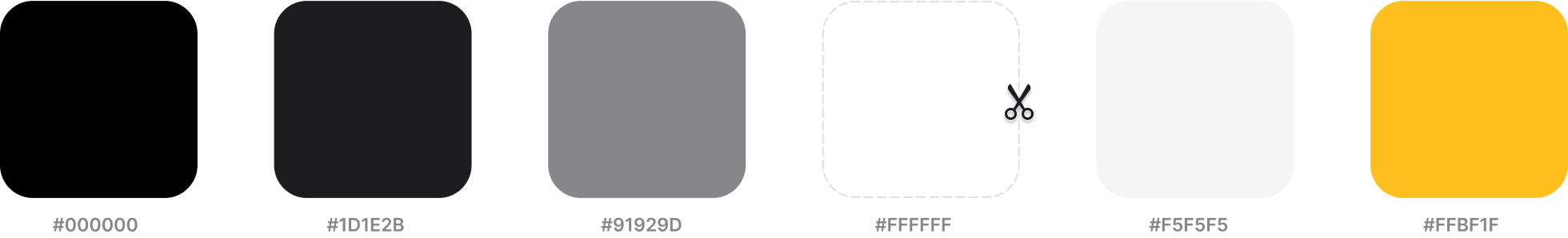
Why #FFBF1F? It's the color of happiness, and optimism, of enlightenment and creativity, sunshine and spring.

Colours

Color palette

Typography

Google font - Regular | Semi-bold | Bold

Typography

Icons

Bootstrap Icons

Icons collection

Components

Design components collection

Final Design

Scissors icon

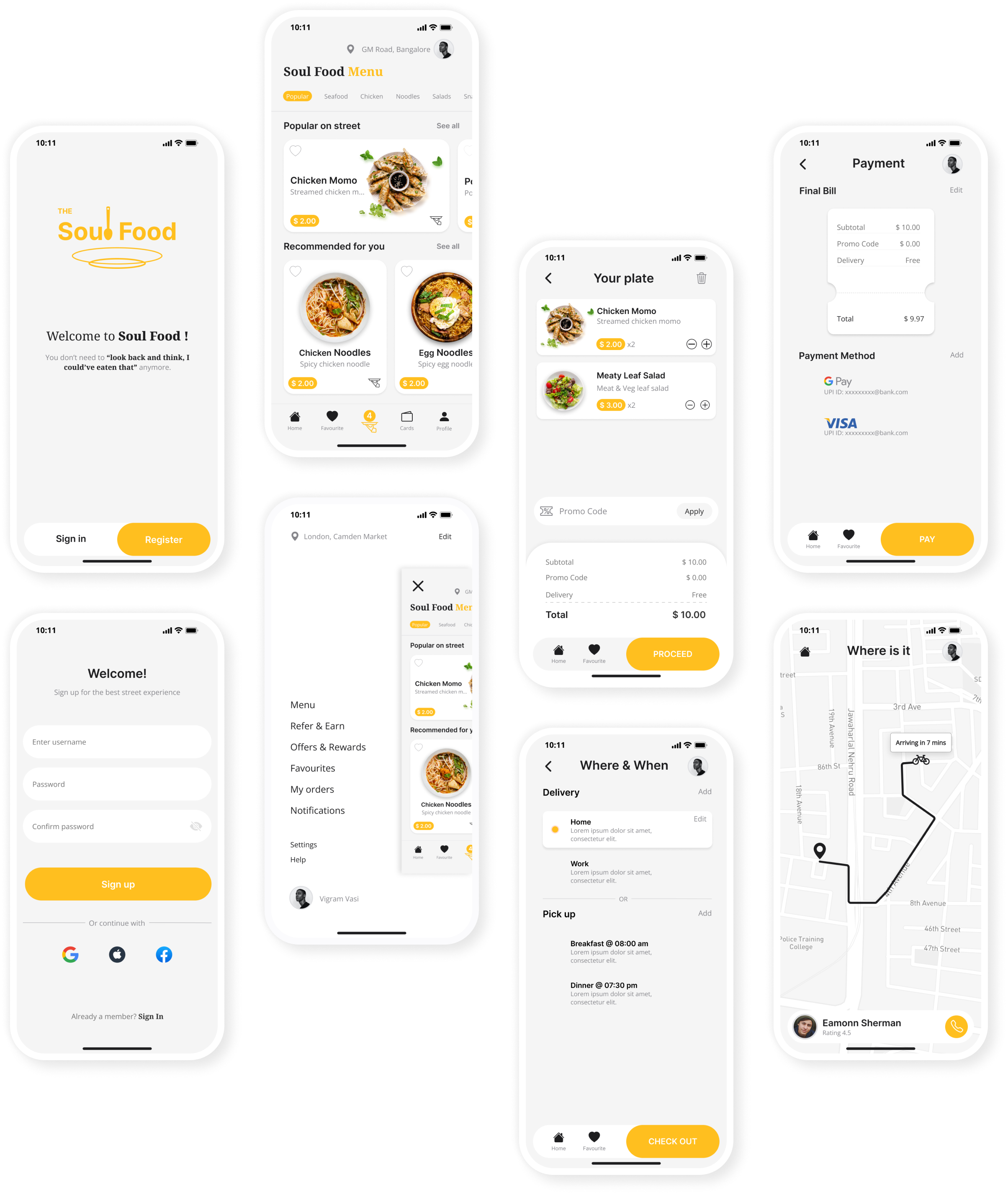
Based on various feedback from interviewees & mentor, I continually iterated my design over the span of 4 weeks and I have chose the minimalistic style.

Waves pattern
Mockups final version
Product details screen mockup

Hygiene Rating

  • Based on the feedback most street food eaters are worried about the hygiene quality of the food.
  • Allowing the customer to submit the hygiene quality of the food, package, and so on along with the product rating encourages the users to order stress-free.
Checkout screen mockup

Add pick-up time

  • Based on the interviewees feedback, l added option to let the user to add a list of predefined pick-up times.
  • Most of the users prefer to place a pickup order at a specific time daily which makes it easy for them to collect the order way back home.

You can interact with the prototype

Here!

Take Away & Lessons Learned

What I’d do differently next time.

This was my first-ever UX project (Yes it is!)🥳. I’m grateful to have been through an entire UX process so I can see what it’s actually like to be a UX designer. On that note, a few things I’ve learned.

Continuous Improvement. I released that UX Design is a process rather than a design technique. In UX Design, you constantly improve the product in an iterative cycle and measure your improvements. I’ve explored so many different options to try finding the right solution for my app users- I’ve ended up “restarting” my project over than 3 times with over 9 iterations of my FIGMA file to make sure every aspect of the app was designed Putting user at front and center.

The user is always right. Conducting user testing and evaluating users feedback at various stages helped me to discover and eliminate pain point at early stages.

Never make assumptions. After the first usability studies I notice an implicit bias in my design decision. So I always recognize assumptions that are being made, then question and clarify them with my users, or target. I was amazed at how much paradigm altering information I uncovered when I simply questioned my assumptions.

Be open to being wrong. Don’t get attached to your ideas, because there’s a large possibility that a better idea than yours exists, or that you could be entirely wrong. When you get too attached to your ideas, it stifles innovation because it limits you from looking at other options. It changes your perspective from looking at ideas to defending your pride. Don’t stifle innovation by being too attached to your idea.

Next Steps

The next step would be to conduct another round of usability studies with a wider range of participants, to determine whether the current solution effectively addresses the users’ pain points.

Thank you for reading. You have reached the end of this case study 🙏🏾. Please feel free to drop your comments and suggestions.
Feel free to reach me at vigramvasi@gmail.com

More projects

Inkbrew | Productivity app

Card title inkbrew

Ink brew app’s goal was to let users organize their digital thoughts, teams and individual tasks, bookmarks, notes and files in one place. Less may not be more, but it is significant sometimes.

In Progress

Card title inprogress

The more we get attached to technology the more detached from the people, life and elders. My journey app's goal is to enable everyone to share their life story and their learnings with others to help them do better in their life.

Go to page top