
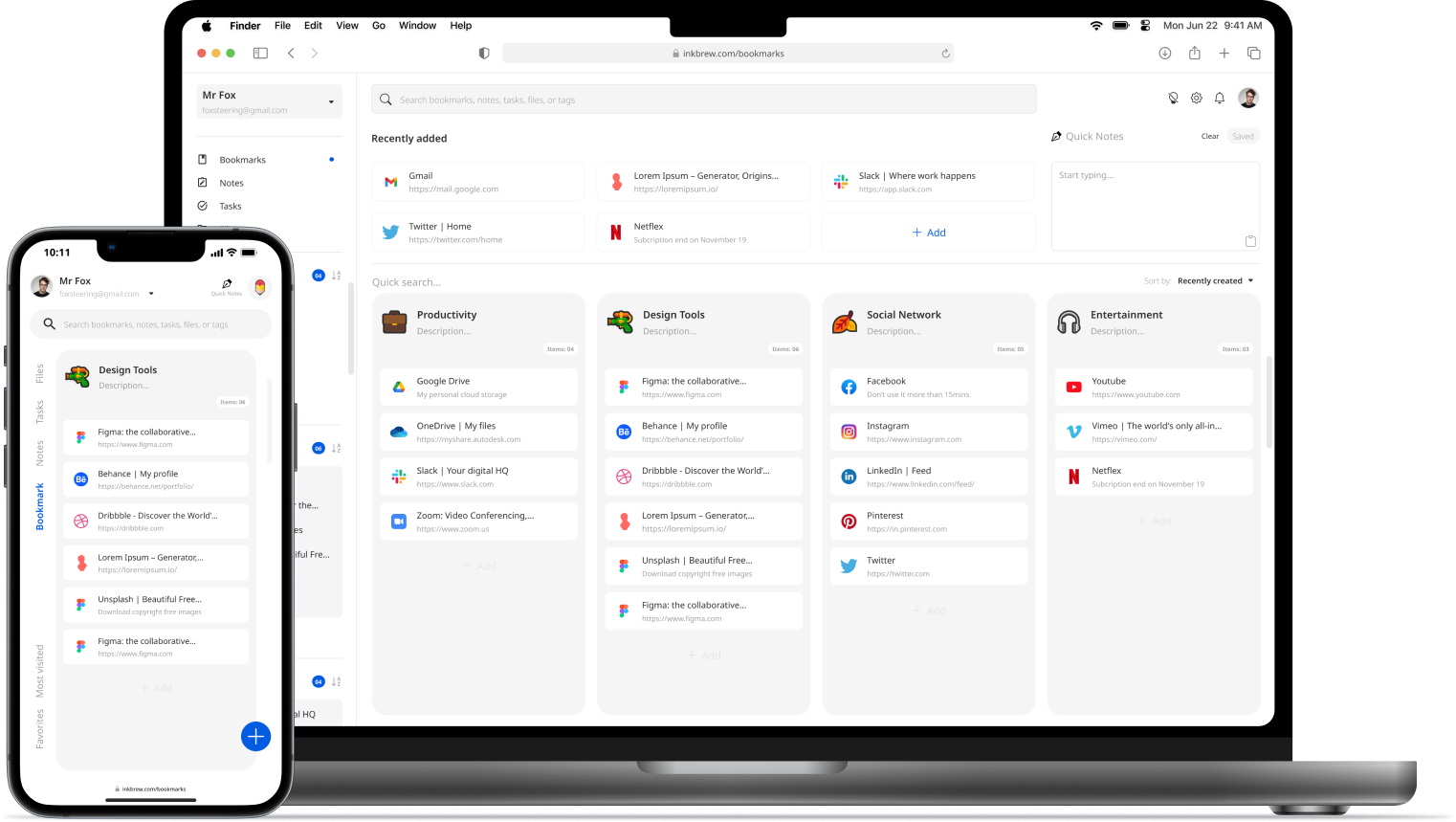
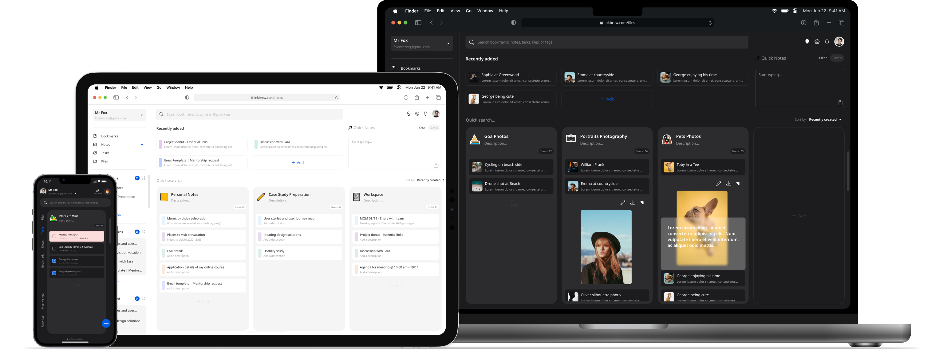
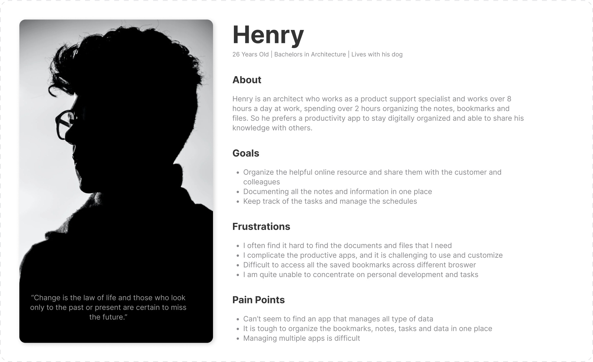
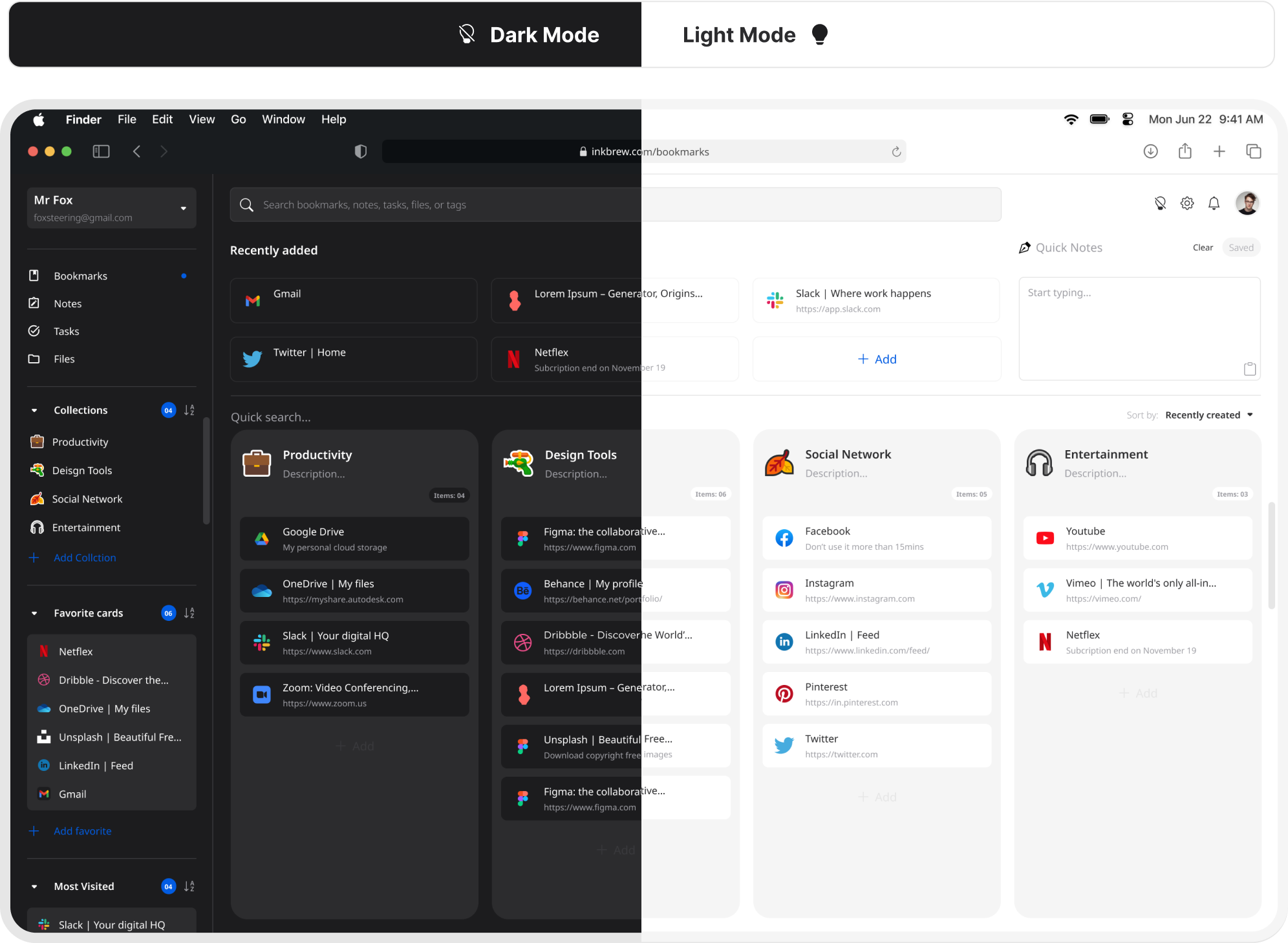
Ink brew app’s goal was to let users organize their digital thoughts, teams and individual tasks, bookmarks, notes and files in one place. Less may not be more, but it is significant sometimes.
Ux Designer
4 Weeks
2022
At this age, we have more tools to be digitally organised. However, most apps aren't easy to use at their full potential. People tend to use different tools to manage various tasks. Sometimes all they need is something simple that doesn't need a scientific brain to figure out how to use an app which is supposed to help them stress less. That's where Inkbrew comes in.
I used the Lean UX principle in the development of the “Inkbrew” app which focused on the user experience under design. It requires a greater level of collaboration with the entire team. The core objective is to focus on obtaining feedback as early as possible so that it can be used to make quick decisions.

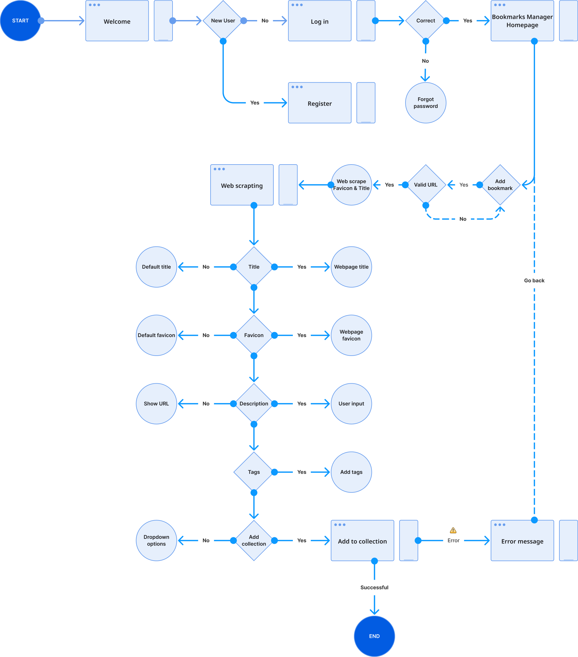
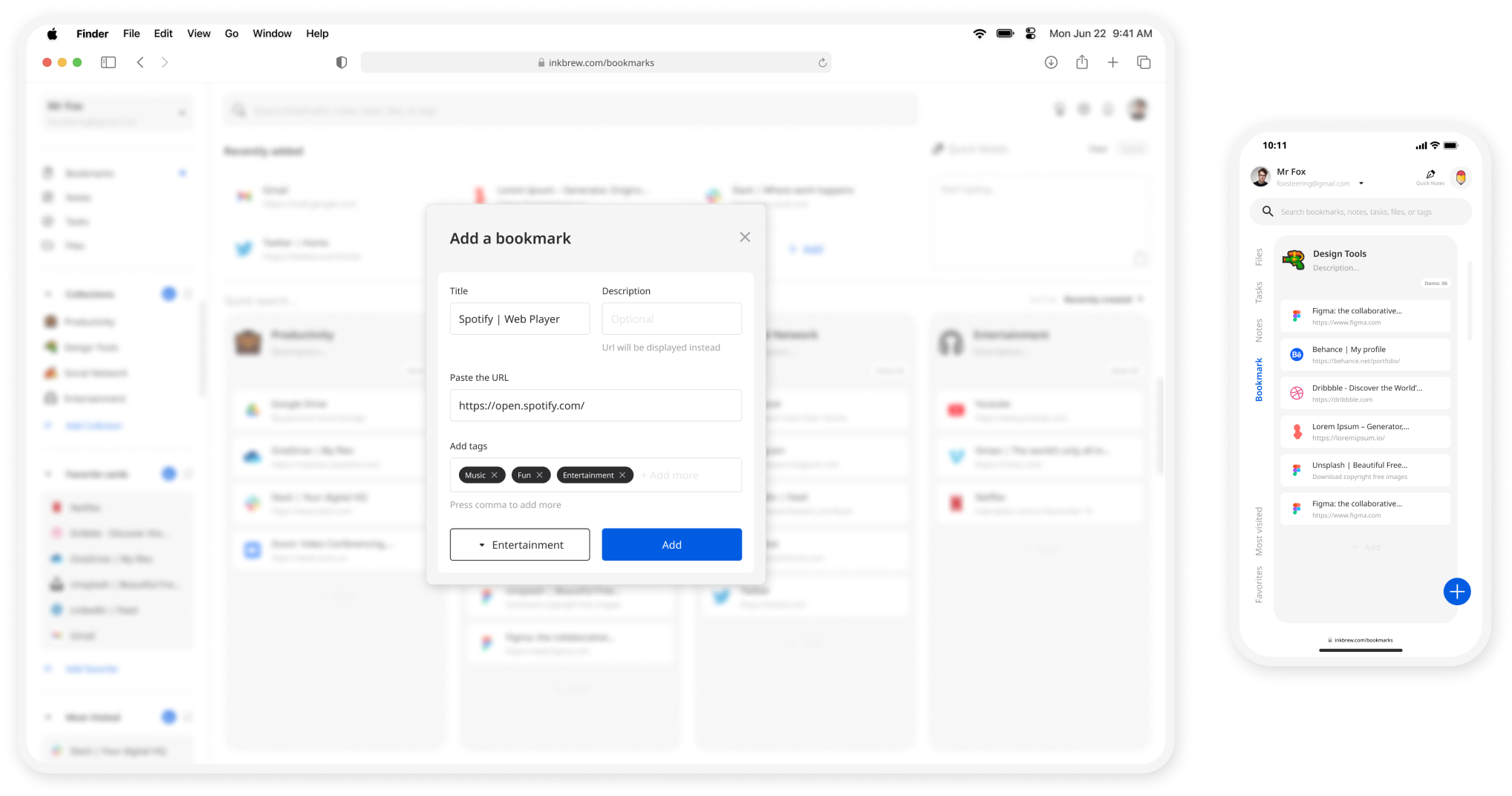
The user flow lays out the user’s movement through the product, mapping out every step the user takes-from the entry point right through to the final interaction, such as placing a pickup order helps determine the information architecture.
The following user flow shows every step the user takes from the start point to adding a new bookmark.
I followed Crazy 8’s in my Design Sprint method to push beyond my first idea and generate a wide variety of solutions. And I have turned my revised sketch into a digital low-fidelity wireframe prototype.
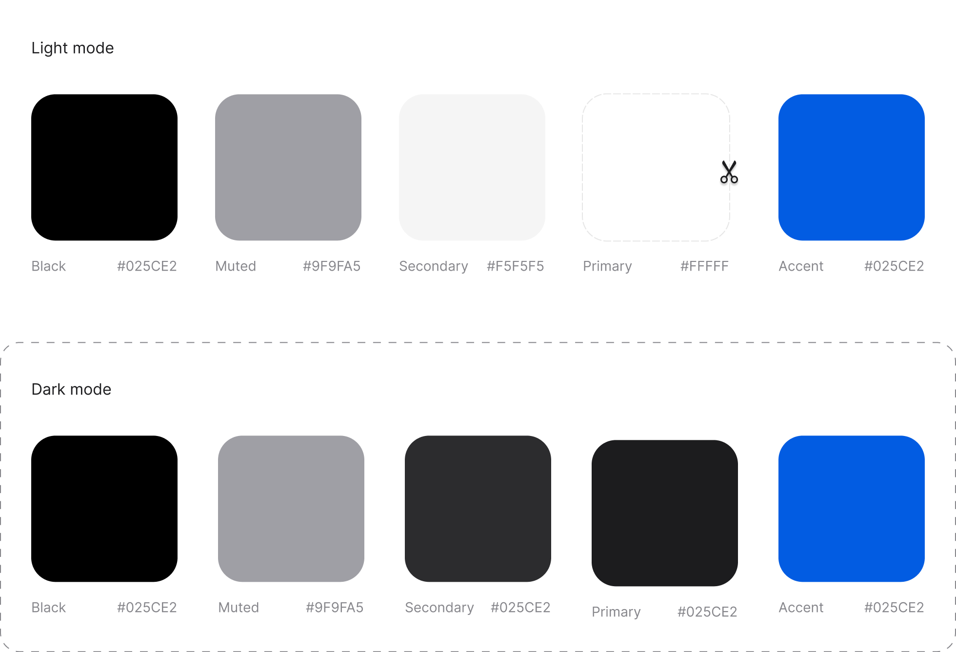
Why #FFBF1F? It's the color of happiness, and optimism, of enlightenment and creativity, sunshine and spring.
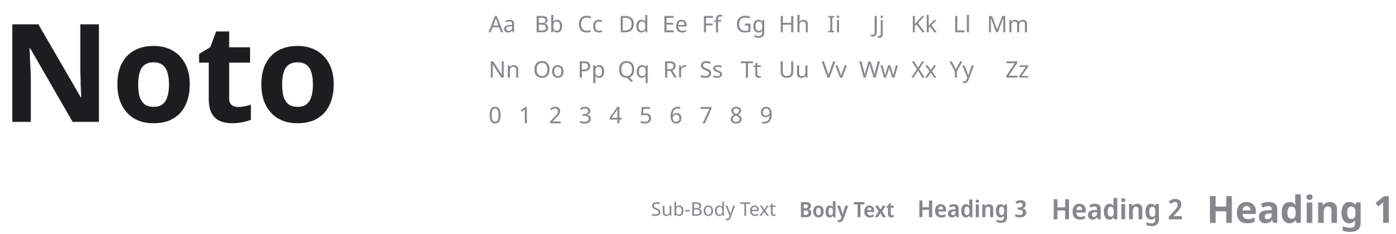
Google font - Regular | Semi-bold | Bold
Bootstrap Icons
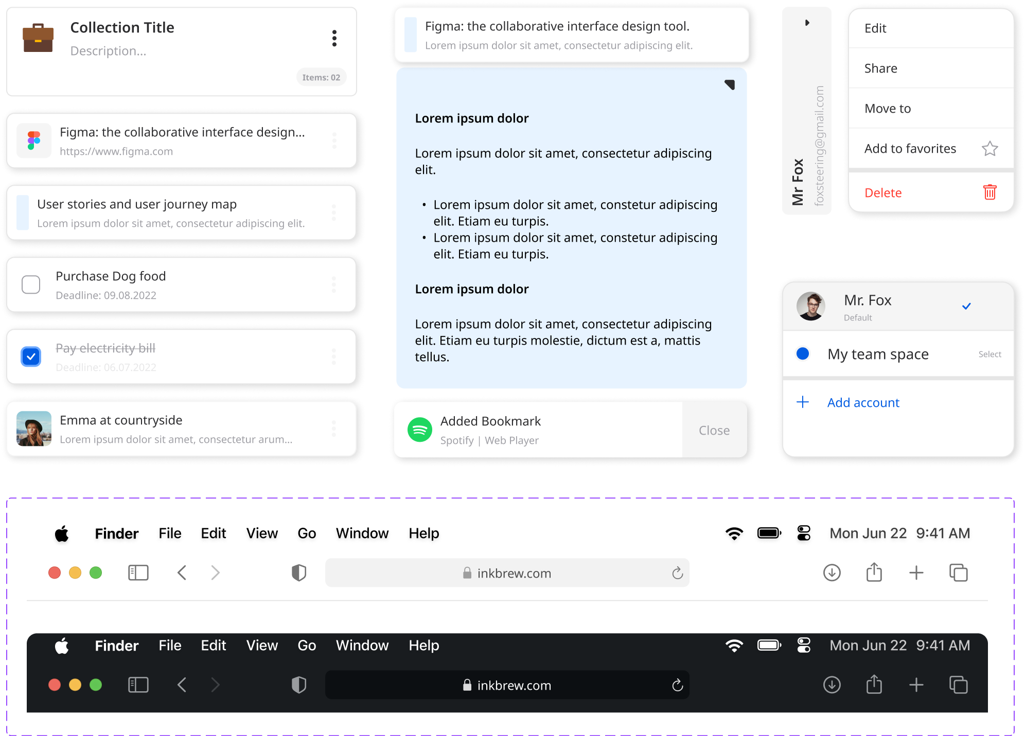

Based on various feedback from interviewees & mentor, I continually iterated my design over the span of 4 weeks and I have chose the minimalistic style.
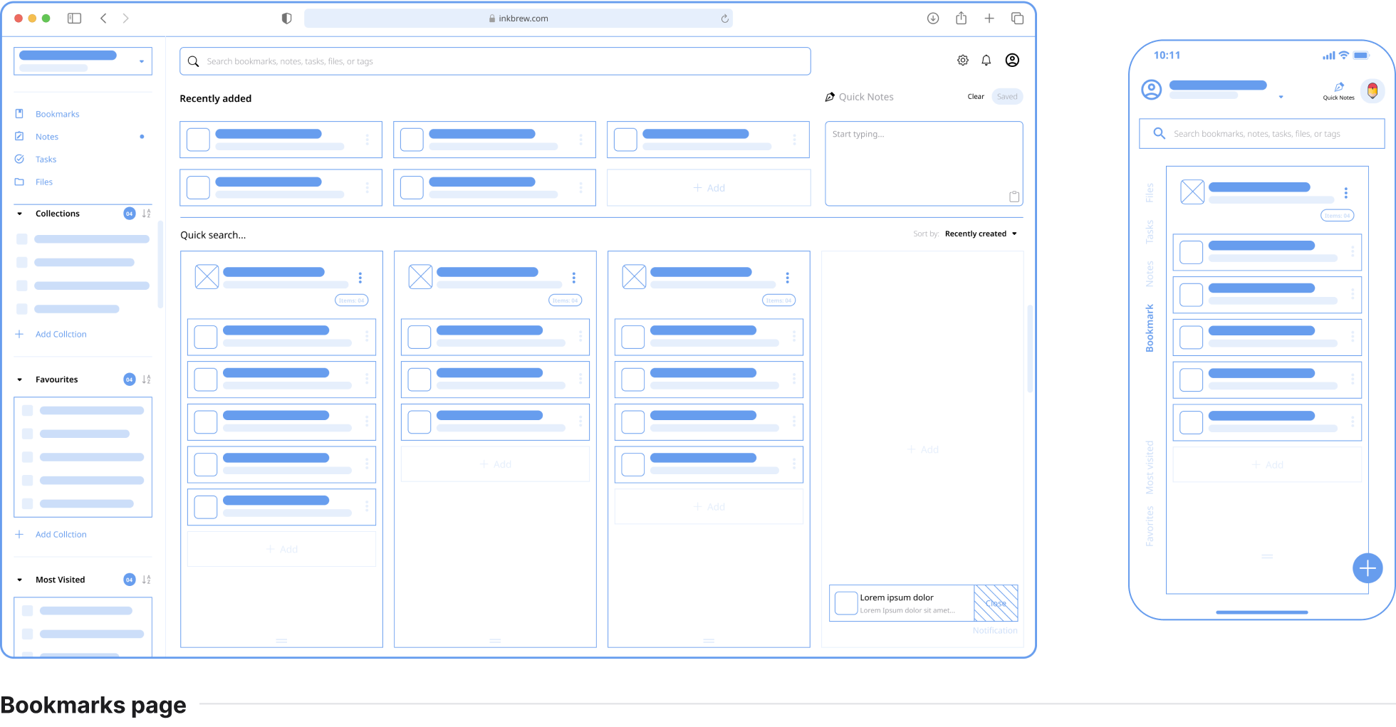
- Based on the feedback add an option to allow users to add tags when adding new items so that users can link items across different categories with tags.
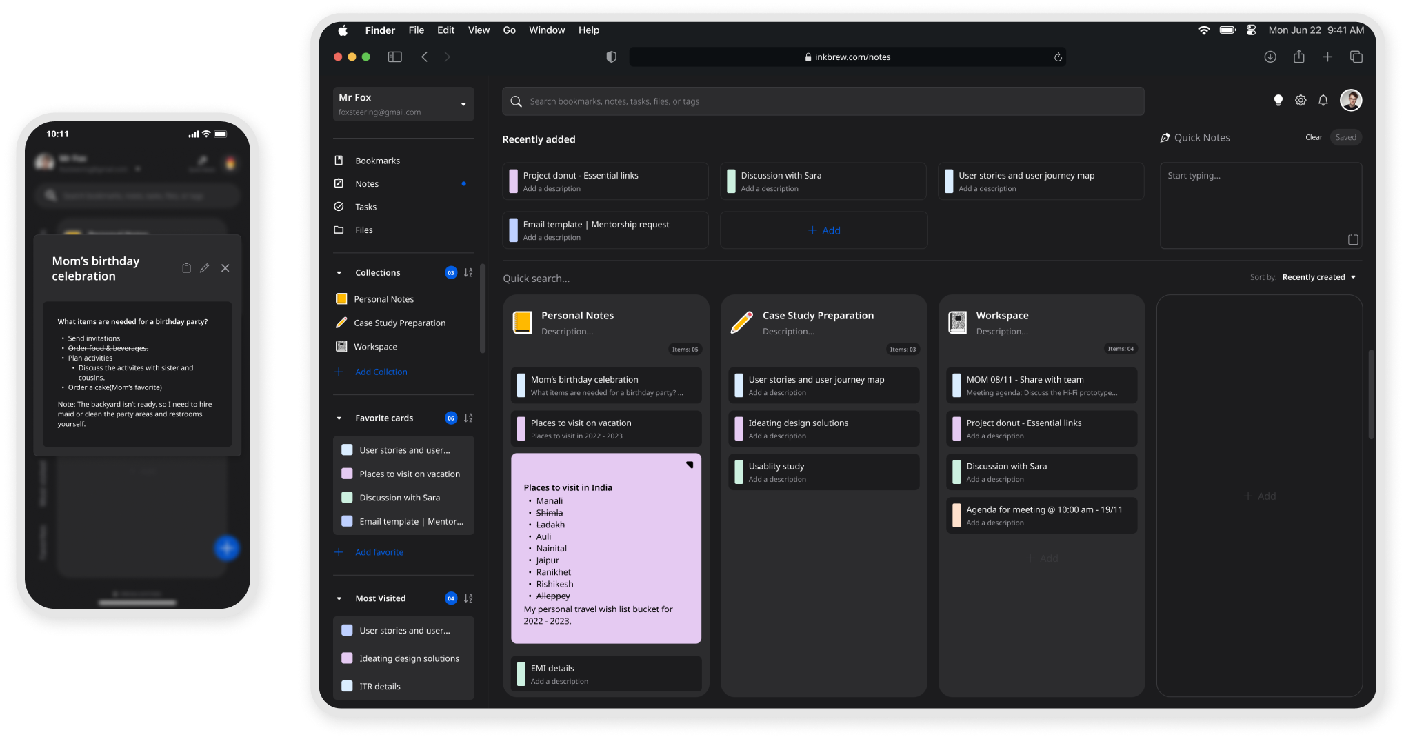
- Based on the feedback customer would like to have a unique background for each note.
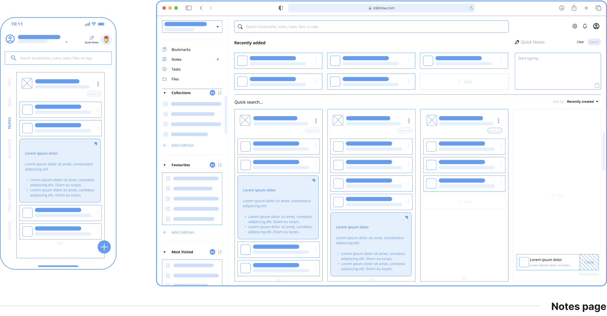
- Based on the feedback apart from being able to preview the notes, added an option to open the notes in full screen for easy readability.
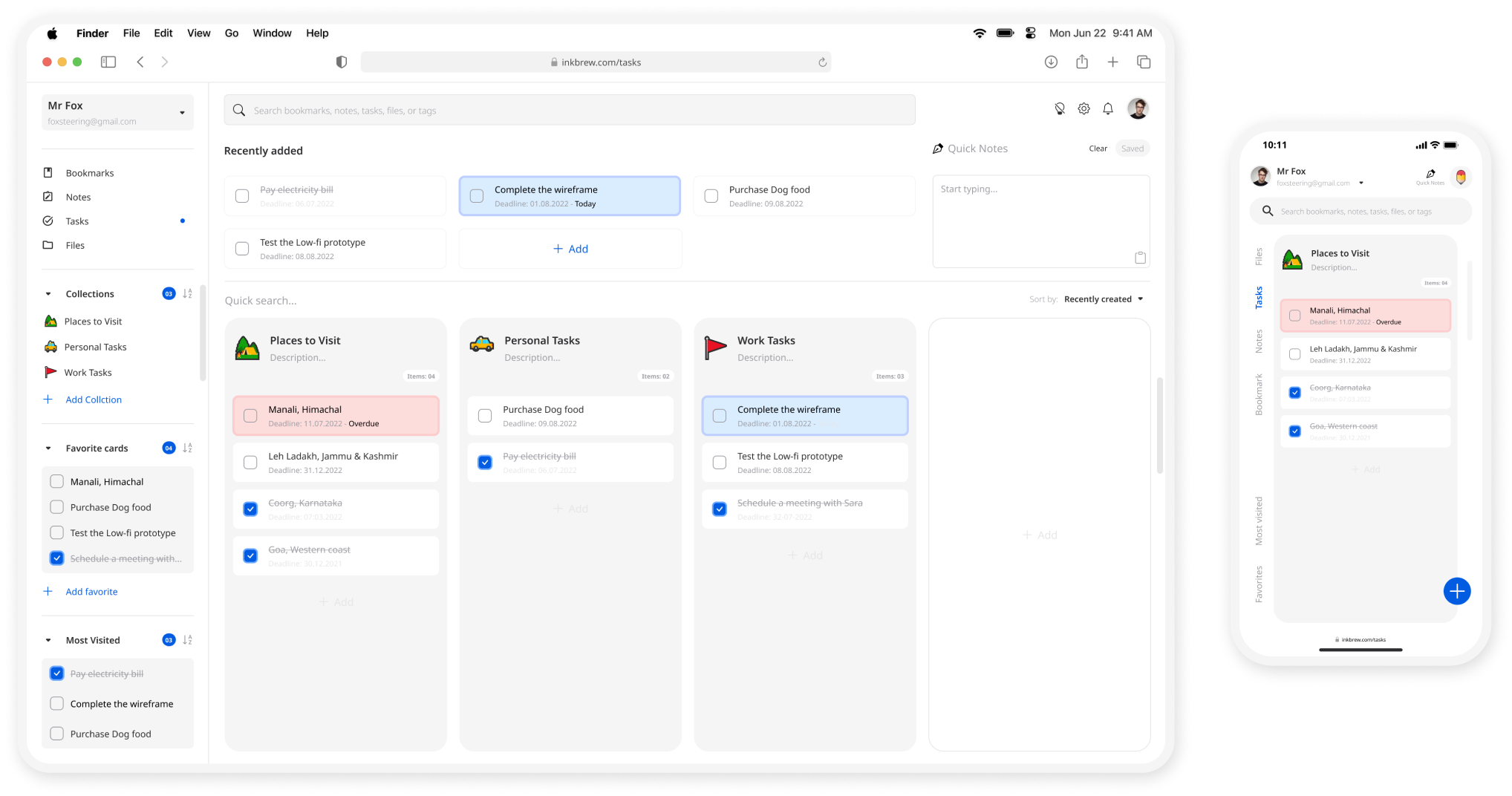
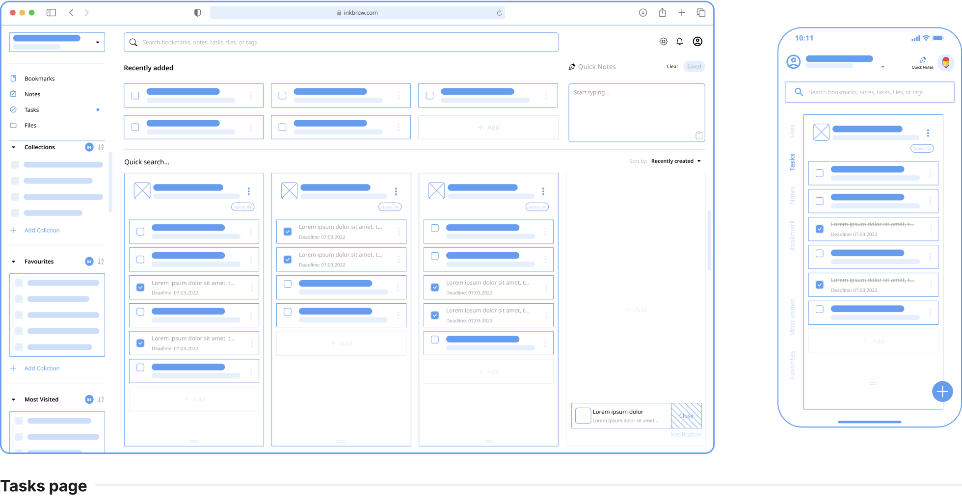
- Based on the feedback users wanted to visually identify when the tasks is overdue.
- Users wanted to see the deadline date without opening the task. So added the deadline date below the task's title.
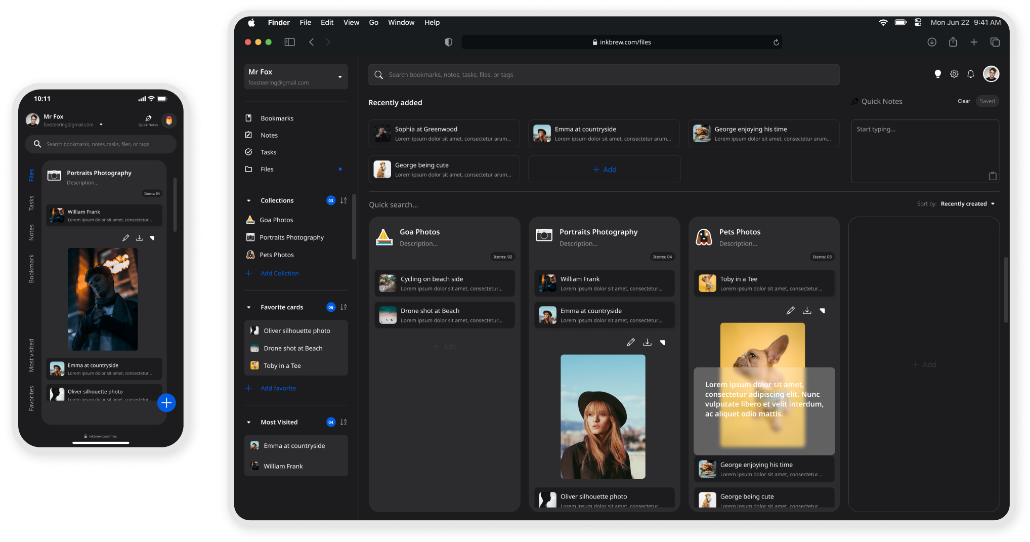
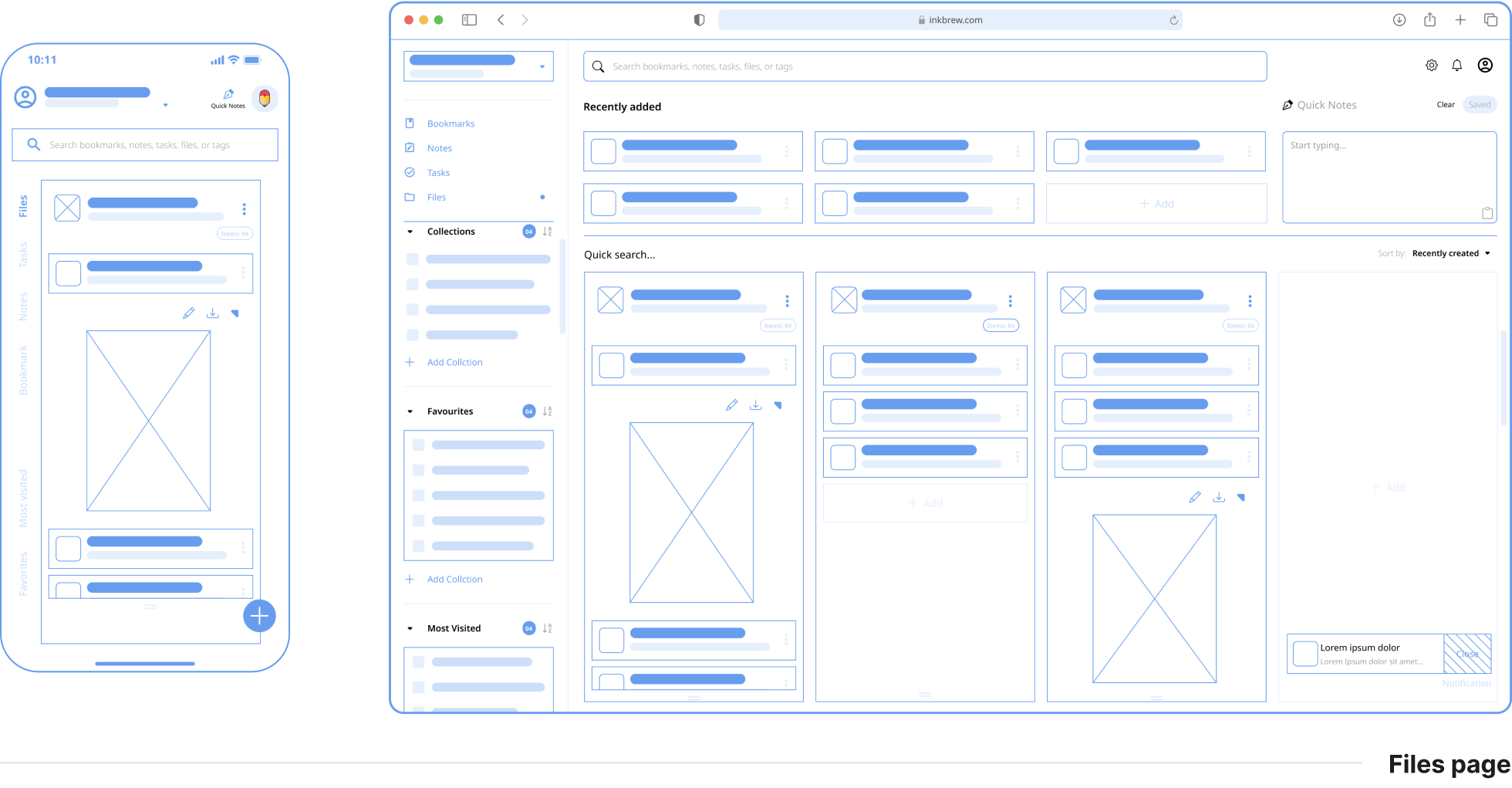
- Based on the feedback users would like to see a preview of the files before sharing, downloading, or exporting.
- Based on the feedback most of the users would like to add a description of the file add feature when users preview the file it shows the description of the file.
You can interact with the prototype
Continuous Improvement. I released that UX Design is a process rather than a design technique. In UX Design, you constantly improve the product in an iterative cycle and measure your improvements. I’ve explored so many different options to try finding the right solution for my app users- I’ve ended up “restarting” my project over than 3 times with over 9 iterations of my FIGMA file to make sure every aspect of the app was designed Putting user at front and center.
Never make assumptions. After the first usability studies I notice an implicit bias in my design decision. So I always recognize assumptions that are being made, then question and clarify them with my users, or target. I was amazed at how much paradigm altering information I uncovered when I simply questioned my assumptions.
Be open to being wrong. Don’t get attached to your ideas, because there’s a large possibility that a better idea than yours exists, or that you could be entirely wrong. When you get too attached to your ideas, it stifles innovation because it limits you from looking at other options. It changes your perspective from looking at ideas to defending your pride. Don’t stifle innovation by being too attached to your idea.
The next step would be to conduct another round of usability studies with a wider range of participants, to determine whether the current solution effectively addresses the users’ pain points.
Thank you for reading. You have reached the end of this case study 🙏🏾. Please feel free to drop your comments and suggestions.
Feel free to reach me at vigramvasi@gmail.com


